In order to have the best chance of winning prospective clients or even just getting another social media follower, it’s crucial that your message is very clear.
Your call to action is a few simple words that can make or break the process.
A call to action is a clear “next step” for people interacting with your website, your blog posts, and your social media posts. In fact, everywhere you are able to share a message, you should end it with a clear next step for the audience to take.
Single, Clear Call-to-Action
If you’ve got the attention and interest of a potential client, The next step is to turn that interest into action.
You need a single, clear call to action (“CTA”) that aligns with your business goal and the medium it’s being delivered through:
- A call to action is often a button that calls on the website visitor to take an action.
- It’s often placed at the end or throughout a piece of content or sales page.
- It’s a direction, prompt or request that guides them towards the next step in their customer journey.
Each marketing asset that a prospective client might engage with should have a clear call to action that aligns with your business goal, and aligns with their stage of awareness.
I like when there’s a clear and obvious call to action on every webpage on your website – what that is can vary from page to page depending on the content.
The Goal
The ultimate goal for most of us is a sale – money in the bank.
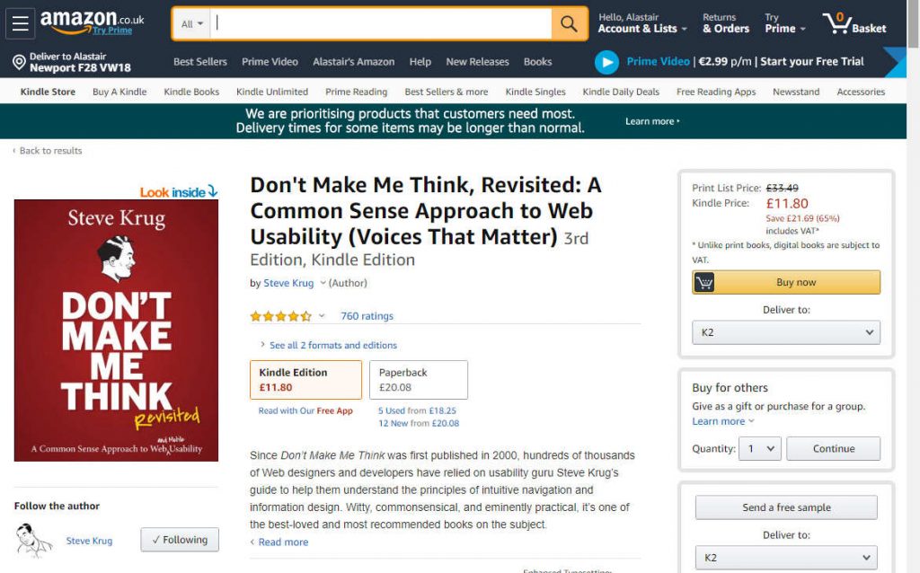
For ecommerce retailers like Amazon, the call to action can simply state “Buy now”:

Unfortunately, sales aren’t quite as simple in the world of consulting services. It’s the opposite end of the spectrum from a simple transactional sale for Amazon.
Most consulting engagements take time – you’re solving important, complex business problems for your clients, often risky and sometimes transforming their business. The engagements can be months or even years in duraction.
And the sales process takes quite some time also.
So what should the call to action be for a consulting firm website? Let’s look at the engagement lifecycle for a moment.
Typical Engagement Lifecycle
For many consultants, a typical engagement might look like this:
-
- Initial enquiry from prospective client
- First contact to qualify/check it’s a good fit for both parties
- Sales meeting to discuss project more in depth and agreement in principle
- Proposal presented to client (video)
- First payment or contract signed
- Project starts
- Project delivered
- Final payment
- Possible re-engagement
Our initial end goal here is the payment or signed contract, but the start of the engagement from our perspective is the initial enquiry. Generating those enquiries is the goal of our marketing – lead generation.
Stages of Awareness
The Customer Journey – also called the Buyer Journey or Customer Path (and sometimes less correctly referred to as Sales Funnel or Conversion Funnel) – takes a prospective customer through several different stages of awareness. Here’s one way we can model that:
- Unaware of Problem
- Problem Aware
- Solution Aware
- Consideration (sub-stages: Interest, Respect, Trust)
- Agreement in Principle
- Purchase
If they reach out to contact us, then our prospective client is at least at the Interest stage of Consideration, and our goal now is to figure out if they have a problem that we can solve, demonstrate that we are credible (Respect) and have their best interest in mind (Trust).
The real power of content marketing is that it can also move them into Respect and Trust, and even into the Agreement in Principle stage, even if you’ve never spoken to them! That’s why some marketers like me view inbound lead generation to be vastly superior to cold outreach methods like telesales.
What is the most appropriate Call to Action?
“It depends” – the age old answer of experts everywhere. But in this case, I believe that the choices are easy to pare down:
Subscribe
If they are in the TOP part of the customer journey – Unaware, Problem Aware or Solution Aware – then a good call to action is to ask them to subscribe or follow you in some way.
Some options here are:
- Download our free resource by subscribing to our mailing list
- Follow us on Twitter
- Connect with me on LinkedIn
Contact
If they are in the BOTTOM part of the customer journey – Consideration – then a good call to action is to ask them to contact you in some way.
The most obvious option is simply to ask them to call you, but there are some other more nuanced options that can make your life easier.
Qualify – Check for Fit
Here are several ways to qualify a prospective client:
- Qualification call: setting up a quick (10-15 minute) initial call is good practice. If it seems to be a good match, at the end of that call you arrange the more in-depth sales meeting.
- Manual pre-qualification with application form: they fill in a form on your website and you get the answers by email. You can review and make a decision based on the information they provided.
- Automatic pre-qualification with a mini-survey: you can have them complete a short survey on your website – if they answer the questions in a certain way, the form will take them to the next step, otherwise you can have it automatically suggest some alternative options to them based on their answer choices.
If you are getting a lot of leads, then I suggest you pre-qualify them. If you are not getting so many, then a qualification call is worthwhile as you can learn a lot from speaking with prospective clients.
I’ve written more about which call-to-action to choose here.
3X Your Leads by Using a Button
You have decided on which call to action is appropriate for you – now you need to add it to your website.
There has been a massive amount of research about how your call to action should appear, because it can make or break the sale.
I had one of my workshop attendees report a 3X improvement in leads after changing the call to action from plain text to being a button. In real terms, that allowed him to increase his prices 40%.
What’s usually most effective is a button that looks clickable, stands out from the rest of the page design, and has text that clearly describes what clicking it will accomplish for the visitor.

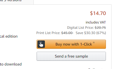
This example from Amazon shows a well-tested call to action. The orange color stands out against the rest of the page design (scroll up to see the full page previous example). The icon on the button shows the visitor a clicking action, and the call to action text is perfectly clear as to what happens. (Also, note that the secondary call to action “Send a free sample” is colored so as to blend into the page background and has no icon).
All of these details matter online, where website visitors scan read long web pages very quickly and look for visual cues for how to take action.
Conversion rate
In marketing terminology, we use the word “conversion” when we talk about having the visitor take a positive action of some kind. Conversion rate is the number of actions taken over the number of times the CTA was viewed. If you have 100 visitors to a webpage and 2 of them contacted you through a form on the page, then the conversion rate was 2%. Conversion Rate Optimization (CRO) is a subset of online marketing where we focus on optimization of web page design and copy to increase the number of conversions. I’ll talk more about CRO in later articles.
Do Repeat Yourself
It’s ok to have your call to action button in more than one place on the page. Some sales pages have it at the top and bottom. Some even have it numerous times throughout the page, and others again simply have one call to action button that remains static as the rest of the page scrolls.
Action Plan
Plan out two calls to action.
- The first priority is for those who are in the bottom of the customer journey and ready to enquire. Create a “Contact Us” or “Schedule a Call” call to action, possibly doing pre-qualification if you can.
- After that, focus on the people who are in the top half of the customer journey. They’re not ready to contact you, so offer them a compelling reason to subscribe to your email list – maybe a free whitepaper or report. It could also be a webinar or even an email course like I use here. (I’ll cover this topic in more detail later.)
What call to action are you using for your website? Do you have one for the top half of the customer journey? Connect with me on LinkedIn and let me know!

